Everybody knows Preshburg. On any given Friday in their neighborhood, you’re likely to see every third person carrying a Preshburg bag. When they came to us, we offered branding work that would take them from popular to iconic. Standout green. Stark white. And a single stripe that tells you, “This is going to be delicious.”
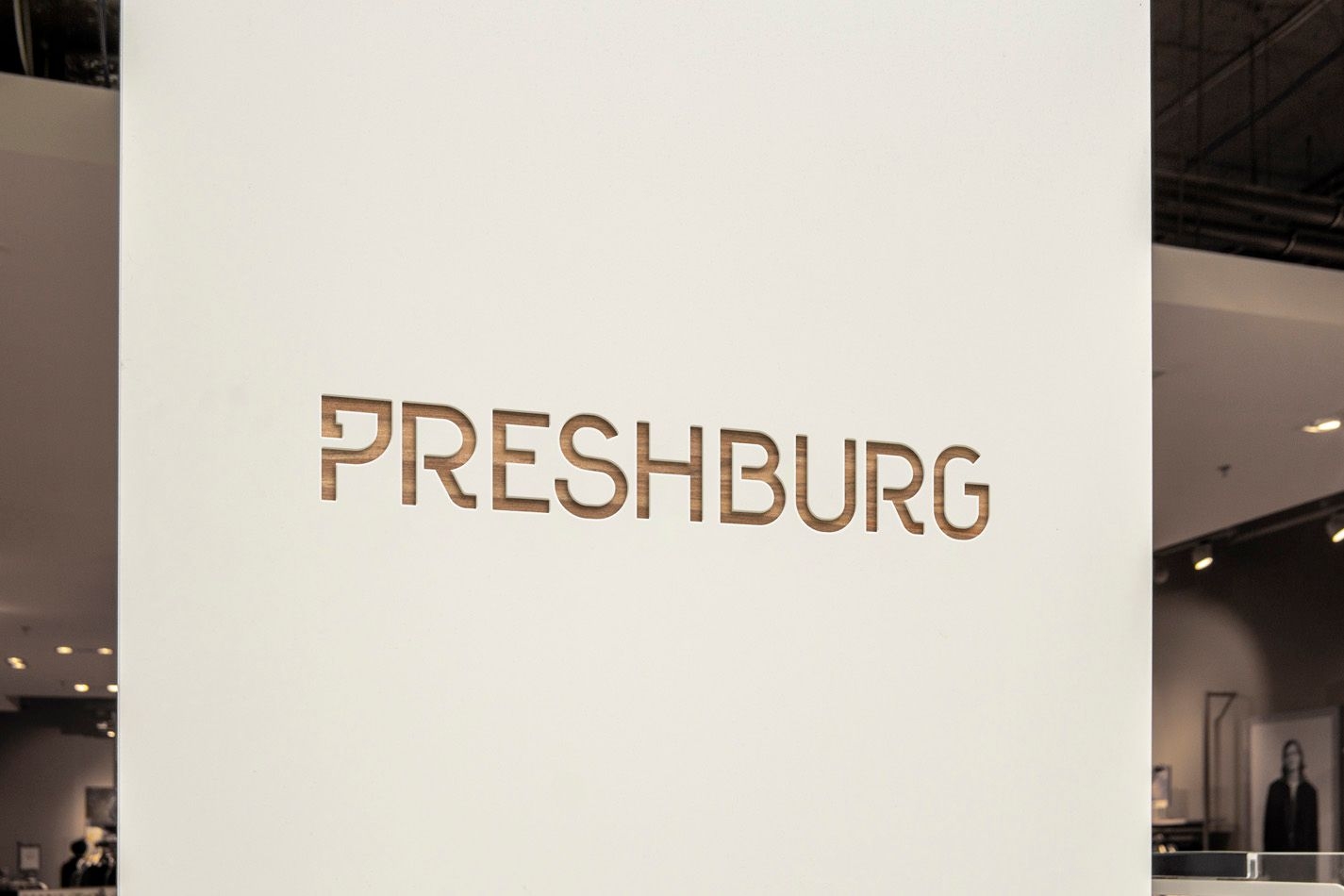
A modern brand with roots in the past. In the custom lettering for Preshburg’s logo, we included the Hebrew letter pey, as an homage to the traditional tastes of some of the bakery’s most popular pastries. Whenever we build a brand, we try to find what’s special about each company, and make that memorable. Preshburg is no different.
We’re always asking ourselves: “Is that necessary,” “Can that be shortened,” “How can we simplify?” We never want a passion for design to get in the way of powerful communication. For Preshburg, we focused on telling their brand story through bold simplicity — the design gets the attention and the taste holds it.


